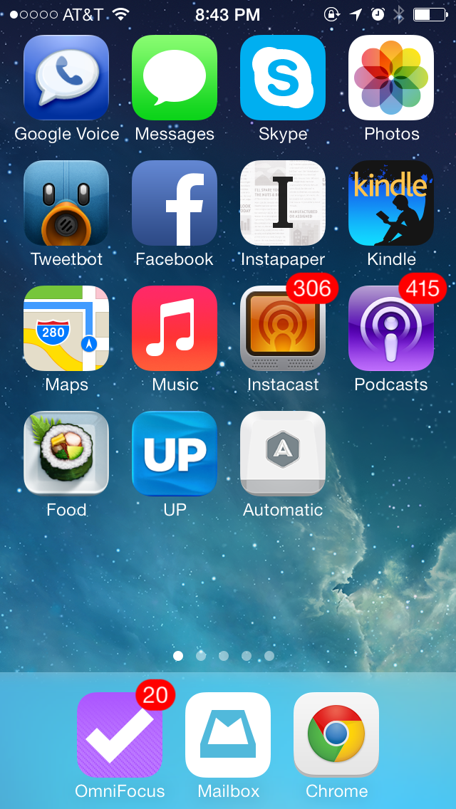
This weekend I reorganized my iPhone home screen like this:

I tried not to fill the entire screen, keeping one full row empty and one spot in the bottom row, to encourage me to go the extra mile when removing the non-essential apps, and to give new apps a chance to make it to the home screen. The organization is not perfect, but here we go:
- Bottom row (“most important apps”):
- OmniFocus: I use it extensively on the desktop, and the iOS version synchronizes with it (in the background with iOS 7!). On the iPhone I use it to enter new inbox items on the go and to deal with a few contexts (standup meeting at work, errands, and contexts for a few people I often interact with).
- Mailbox: my email client of choice. I use it to do a first pass on my email, including archiving unimportant items.
- Chrome: my web browser of choice.
- First row (“voice and chat”):
- Google Voice: I moved my number to Google Voice a while back. The app is not great and there is no native integration with iOS’s dialer (Apple doesn’t support it), but for better or for worse that’s what I use now. This covers old-school calls and SMS.
- Messages: iMessage (SMS is via Google Voice).
- Skype: chat and the occasional call.
- Photos: not “voice and chat”, I know, but this had to go somewhere.
- Second row (“social and reading”):
- Tweetbot: my Twitter client of choice.
- Facebook: yes I use it.
- Instapaper: favorite reader.
- Kindle: to remind me that I need to read books.
- Third row (“audio”):
- Maps: I know, it has nothing to do with audio (unless you count directions). This is the Apple Maps app, which works well in my location. I occasionally use Google Maps too.
- Music: provides access to my music collection via iTunes Match.
- Instacast: my podcast client of choice.
- Podcasts: the Apple Podcasts app. Contains a few podcasts which I haven’t yet consolidated with Instacast.
- Fourth row (“health”):
- Food: the Evernote Food app, to remind me to eat well and collect data about it.
- Up: to remind me to exercise and sleep well.
- Automatic: to remind me to drive economically and safely.
I use the camera often but didn’t put the Camera app on the home screen as it is so easily accessible from the lock screen.
Finally, I chose a simple built-in wallpaper. My lock screen has a picture of my family.

Comments powered by Disqus.